
SWEET TOOTH
Sweet Tooth is an innovative app concept designed to help users explore their local communities by discovering hidden gems and sweet spots.
Project Overview
Focused on all things sweet, this concept allows users to filter, curate, and build personalized maps of their favourite treats based on their preferences. The app aims to encourage exploration and support small businesses, all while adding a fun, sweet twist to the process. It also allows users to track, manage, and organize their discoveries.
TYPE
Personal Project
TIMELINE
12 weeks
SKILLSET
Visual design, brand identity, UI/UX design, design system, design thinking, user research
TOOLS
Figma, Whimsical, Illustrator
What’s going on?
The Problem
Designed over a 12-week period, the concept was inspired by my own experiences discovering the best dessert spots and, more importantly, finding a way to keep track of them all.
Understand + Encourage
How might I encourage exploration by lessening the overwhelm of organizing and keeping track of places of interest?
Through initial discovery, I found that most Users are not aware of what’s around in their own neighbourhoods, or just outside of it, and especially if they’re travelling to a new city.
A Sweet Solution
Sweet Tooth solves two problems: breaking down the the concept of proximity—“what’s around me?”; second organizing all that info.
Users are inundated with so much information, that creating a curated list of sweet spots would allow them to explore freely and try something new in a stress-free manner. They could potentially explore more artisan places vs. chains or box stores—helping boost the local economy as a bonus.
flow of searching, refining, and map results
Defining Goals and Mindsets
Approach
Interviews took place to gain insights on their behaviours, needs, motivations and frustrations, along with defining commonalities, to help create an engaging and positive app experience.
The Goal
The main research goal was to discover and understand patterns, pain points and needs, such as how people went about planning a day out, what their objectives are when the day comes, how they explore their neighbourhoods, how they shop, and how much food/eating out has an impact on their social lives.
As these interviews took place during lockdowns, I also wanted to see if the desire for “shopping local” would have a bigger influence moving forward (as a lot of small business’s closed as a result of the pandemic).
Market research was particularly insightful as I centered the app’s foundation around enhancing local communities and supporting small busineses.
User Interviews
Users between the ages of 33-45 were interviewed over the phone. Users were from Toronto, Mississauga (a city just outside of Toronto), Montreal, London, UK, and Paris, France.
Market Research
1) Food delivery/travel/social apps
2) How the pandemic is shifting consumer’s behaviour in favour of artisan/local vs. big box stores; boosting the economy. 1, 2, 3, 4, 5
The Biggest Takeaways
Research
Proximity
If a location was within their neighbourhood, they would jump to visit, and the willingness to try a new spot was higher. If the location was out of town, or in another country for a planned holiday, they preferred to “save it for later/bookmark” and come back to planning when ready.
Organization and Planning is the Key to a Great Experience
All the users describe themselves as planners; 2 citing that work/life balance would only allow them to fully explore on weekends with a BIG goal of ensuring that they maximize the most out of their time out with proper planning.
Fear of Missing Out + Reminders
Users tend to forget bookmarking locations either on Instagram or through their browser. One user mentioned that they were constantly saving places to go to, but felt that they became overwhelmed of lack of organization, or forgetfulness, so they wouldn’t venture beyond their usual places—yet still wanted the chance to experience new trends in fear of missing out.


Exploring the UI
Wireframes
The key central features of the app were the search functionality, the sequence of adding a place of interest to a map, and the listing page.
After user flows were explored, I started to quickly sketch out ideas before moving on to prototyping and testing the initial wireframes.
Prototyping, Testing + Challenges
A goal of the app was to ensure that each sequence in a flow was as quick as possible so that users would continue to feel engaged and open to exploring more within the app.
01. Creating a Map
In the initial prototype, the sequence of steps to create a map to populate via a listing had a pop up to let the user know that a map was created (below). The users who tested the prototype found it didn’t add to the experience, and felt that they just wanted to get on with adding more places of interest into a map.
Core Functionality
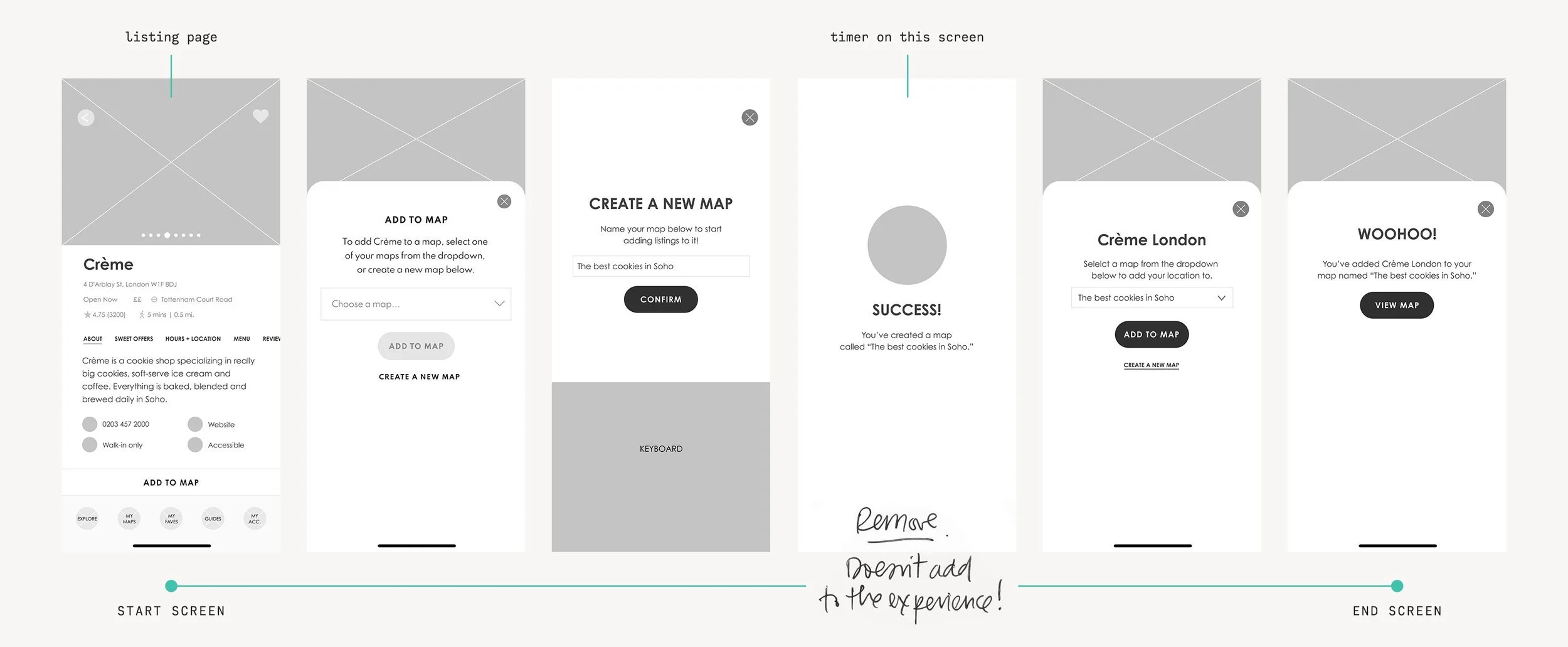
Low fidelity flow for creating a map to add a listing to it
02. The Listing Page
The legibility and organization of the listing page was a design challenge. It went through 3 iterations where hierarchy of typography, iconography, lists vs paragraphs were further developed before landing on a design that made the users feel curious rather than inundated.
When designing the listing pages (below), I found that structure was becoming more key in a user’s choice to add a listing to a map through testing. They wanted to see as much information as possible but have it balanced out with a key experience of food—the imagery.
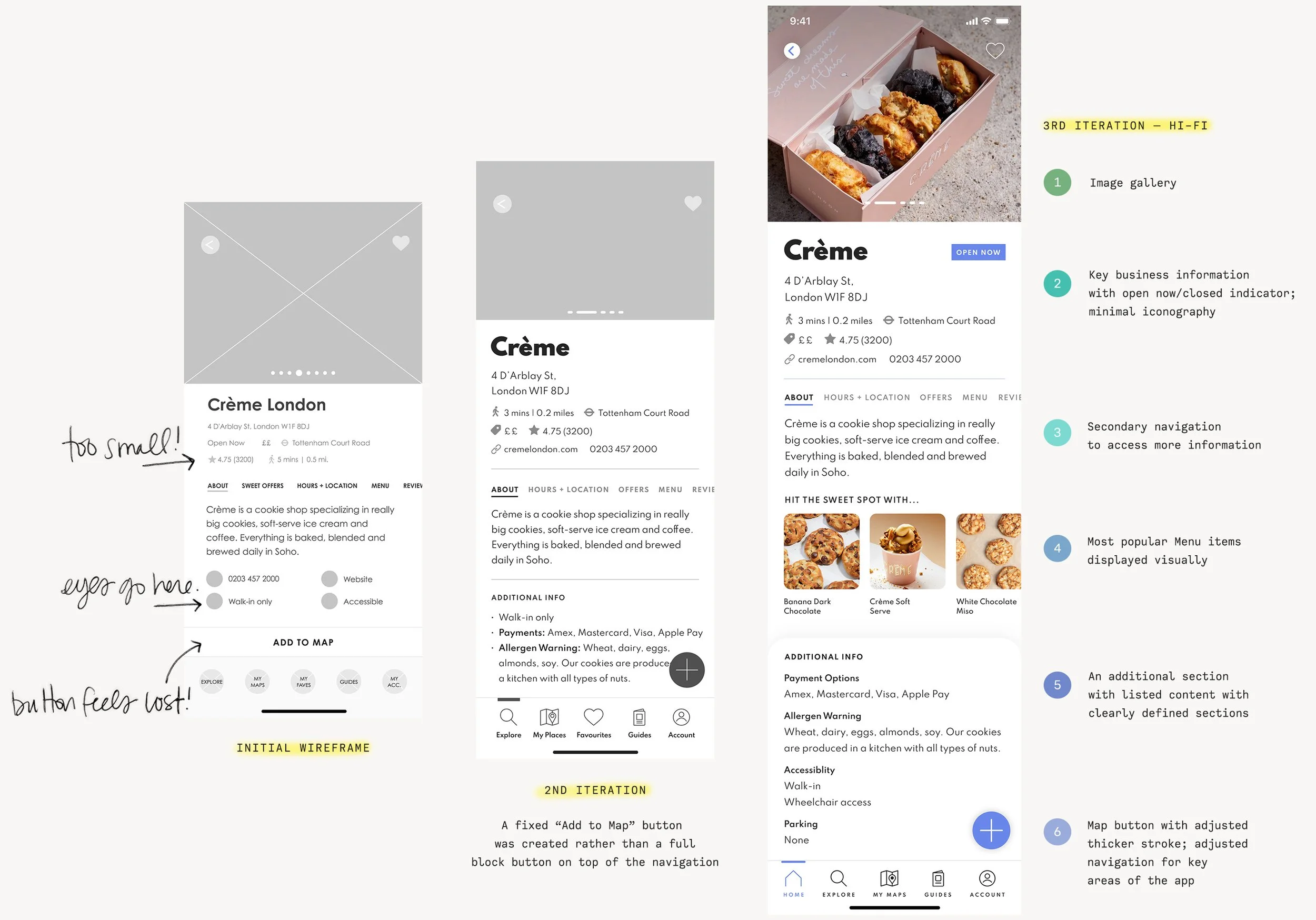
Fidelity evolution of the Listing page
UI + Design System
The design features bold, simple geometric typography paired with a vibrant accent colour, crafting an engaging and lively app experience
Design
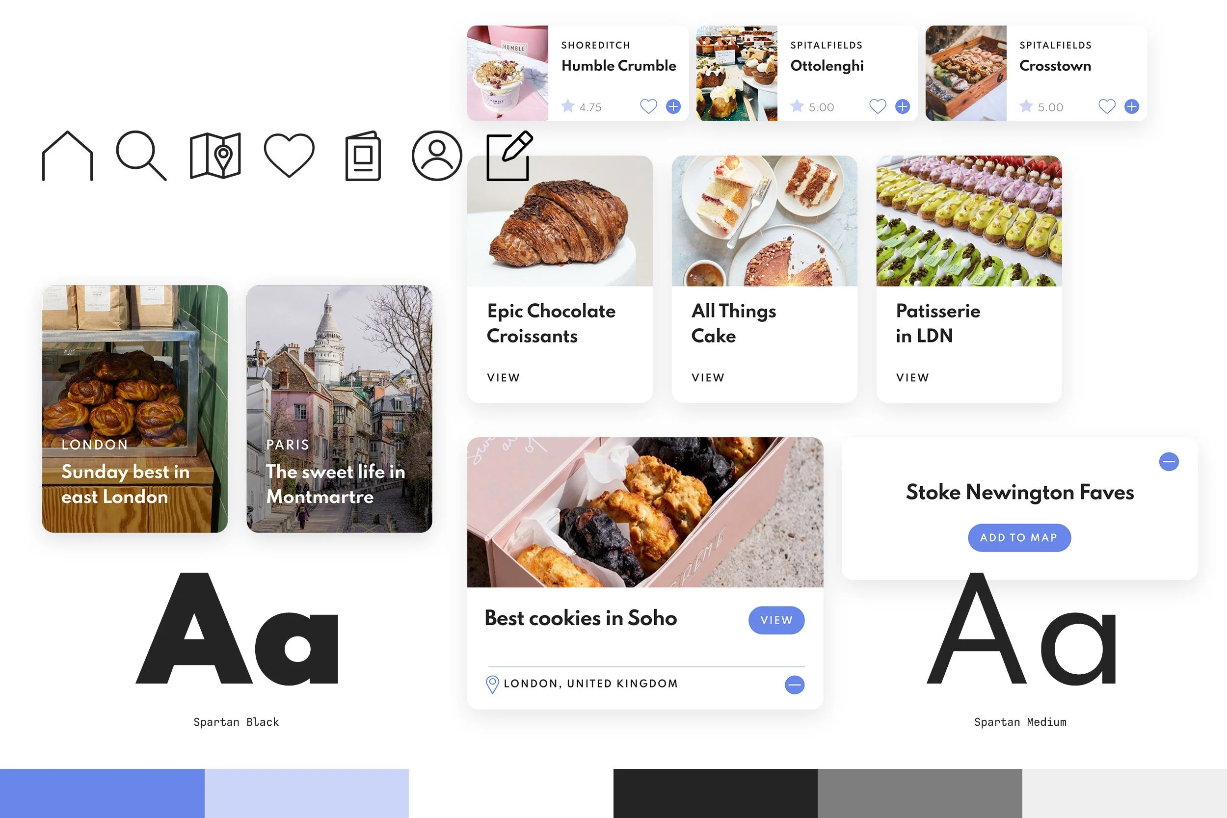
Attention was paid in keeping a minimal colour palette as the additional use of colour throughout the app would predominantly come from the photography (menu items, locations, etc.). White space was used to create balance and to keep the layouts easy to read.
To build out the visual language, consideration was placed on designing iconography for the navigation that did not stray away from the norm (at least in European and North American markets). Cards were introduced to assist with the organization of content.

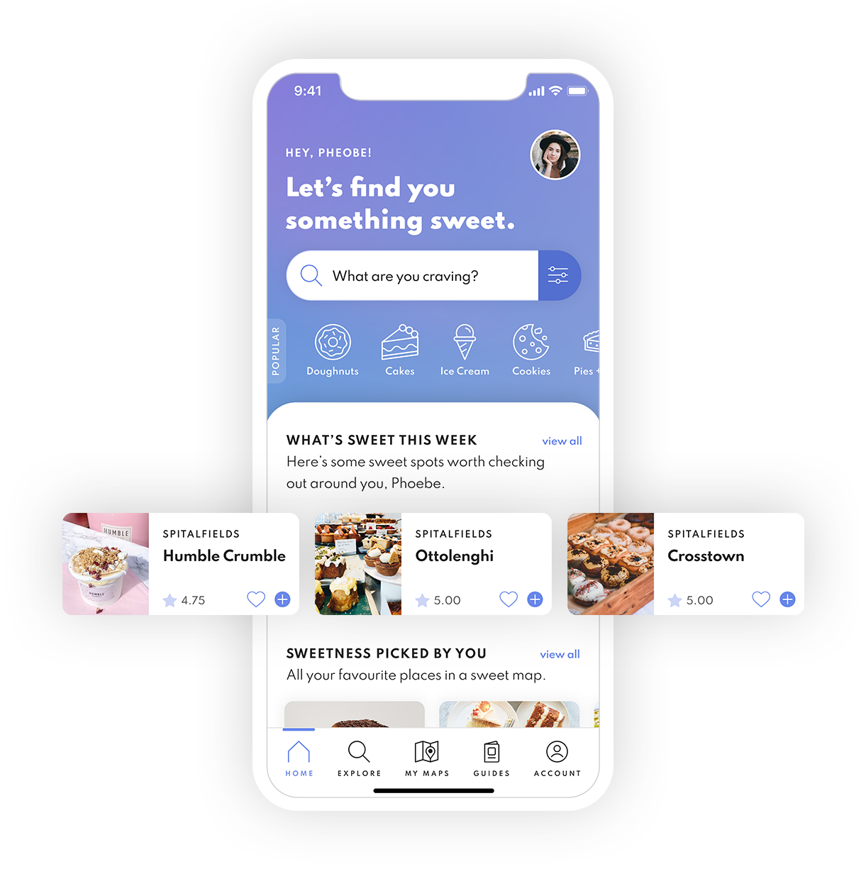
Explore the App
Sweet Tooth—empowering users to explore and curate a “sweet life” wherever they are.
Reflections
01. Take a Step Back, then Move Forward
Sometimes, aiming big serves as a reminder to step back—and that’s perfectly fine! I had grand ideas for the app—envisioning a blend of everything I liked and aiming to fix the aspects I didn’t in the tools I typically use when planning trips or even just a day out. But ultimately, this project wasn’t about me. It became an exercise in adaptability. Through user interviews and thoughtful adjustments, I focused on finding the right balance to support the app’s strategy, ensuring that balance remained consistent from wireframing to the final UI.
02. User-Driven Development
While this was a passion project, the research was very much grounded in reality. At times, getting people excited about a fictional app was a challenge, but using real-world examples of social apps and planning tools, and focusing on habits and behaviours helped strengthen the app’s development. By analyzing both qualitative and quantitative data, I was able to pinpoint features that would enhance user engagement and make the app more robust. With each iteration, users became more involved in the app’s evolution—so maybe, one day this might be real!
Tangerine Banking
✳
Tangerine Banking ✳

V-Hive Dashboard
✳
V-Hive Dashboard ✳
