


TANGERINE
Project Overview
The goal of this self-directed project was to redesign the user experience of Tangerine (a banking app), particularly focusing on enhancing consistency across screens to improve overall flow and reduce cognitive overload.
ROLE
Designer
TIMELINE
3 Weeks
YEAR
2025
SKILLSET
User research, visual/UI design, design systems, design thinking
The Problem
While the app excels at providing a seamless experience with its minimal tab bar, there is one section that feels disjointed—enter the ‘More’ screen, which disrupts the otherwise smooth flow.
What’s going on?
Using the principle of consistency, once a user understands how a specific element or interaction works, they can apply this knowledge elsewhere in the app.
Variations in the interface create confusion because users cannot rely on previous learned behaviours, disrupting their flow. It can force users to re-adjust their mental models each time they switch to a different screen.

01. Starting screens: Accounts, Account listing, Move Money
The three screens maintain consistent elements from the start screen (“Accounts”). There is a clear use of their design system in place for cards, typography, iconography and buttons throughout these screens.
02. More Screen
This screen marks a deviation in the experience. The content appears as a contrast-overlay with a close button—an interaction not known elsewhere, uses smaller typography, and lacks a clear hierarchy of actions, resulting in a less cohesive user experience.
Exploring the
User Journey
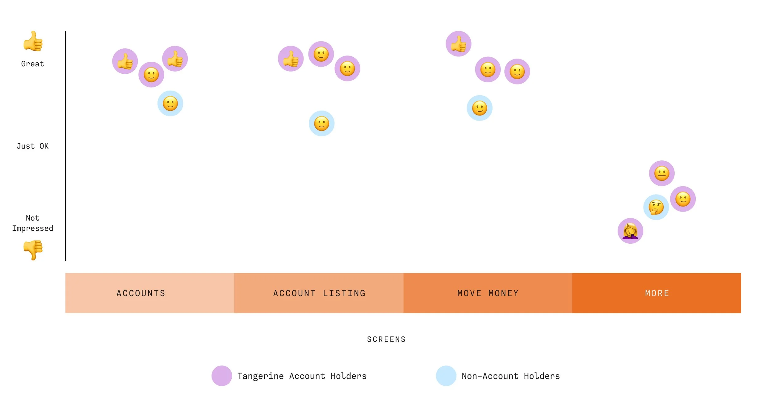
In this journey map, I focused on the key touch points within the app—specific screens and features where the majority of user interactions take place. I also explored the user's emotions at each stage of interaction, as well as identified potential pain points where users may encounter frustrations or difficulties.
I tested my theory of consistency reducing cognitive load by selecting three users with Tangerine accounts and one who banks with a competitor, showing the non-account holder screenshots of each interaction to gain insight into their overall experience with the app. Since emotion was a key factor, we thought it would be fun to use emojis to describe their journey when viewing each screen.
Solution
I applied content grouping to improve usability and enhance clarity by organizing the content in a way that allows users to focus on high-priority actions, while also guiding them to secondary tasks. By leveraging the established design system, the solution ensures consistency throughout.
Design
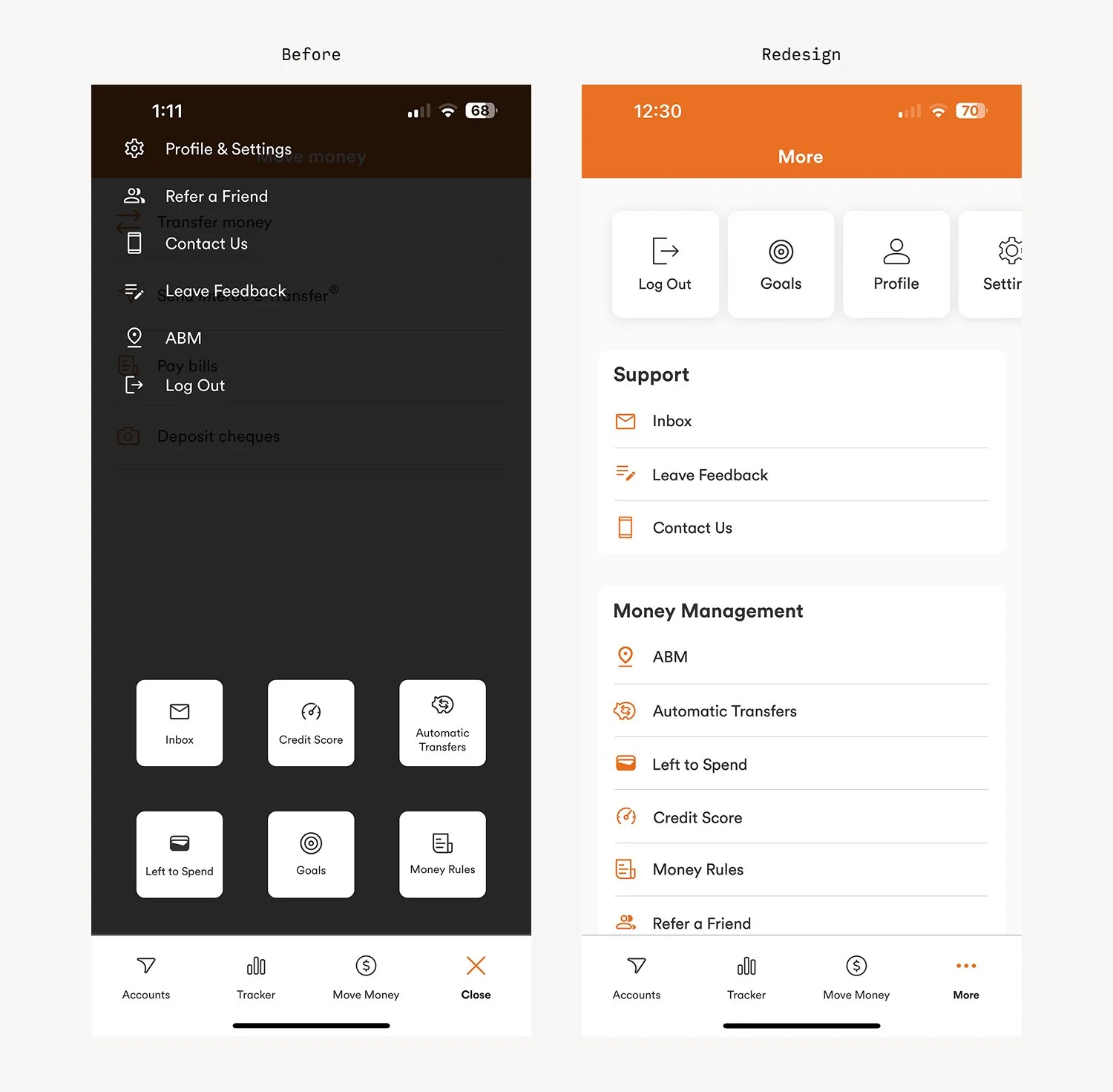
Through market research of Canadian banking apps, I found that many had their own version of a ‘More’ tab—in that it’s typically a catch-all for additional services and tools. Upon further exploration, I noticed the primary action on these screens is often logging out, followed by accessing settings.
In the case of the Tangerine app, the option to log out was not prioritized.
The redesign focused on improving content grouping while maintaining consistency with the design system used on previous screens.
At the top, I highlighted key actions: log out, goals, profile, and settings. Below, I organized additional tools and services into two categories: Support (where users can contact Tangerine) and Money Management (which includes features like finding local ATMs and checking credit scores).
This approach provided users with a clearer task hierarchy while ensuring consistency with the overall design system, ultimately reducing cognitive load and enhancing the app’s usability.
User Feedback
Results + Findings
By ensuring consistency, I was able to enhance predictability and reduce cognitive load, ultimately leading to a more intuitive user experience.
Testing for Feedback
I tested the users for feedback, and one of the active Tangerine users had mentioned that in the original More screen, it took them a couple of seconds to find the log out button. With the redesign, they were able to spot it clearly along with seeing other areas that might be of interest to them, like goal setting, and potentially further engaging with services on this screen.
While my focus was primarily on measuring emotions (for the delight factor), I believe that through content grouping and maintaining the design system, I inadvertently reduced some friction for users as well.
Sweet Tooth
✳
Sweet Tooth ✳
V-Hive Dashboard
✳
V-Hive Dashboard ✳
