THE V-HIVE
Project Overview
The V-Hive is a fitness platform focused on pelvic health, offering users the ability to strengthen their pelvic floor at any life stage.
I was tasked with enhancing the user dashboard experience, with a particular emphasis on guiding users through their tailored, progressive workout programs for an optimal fitness journey.
ROLE
Lead Designer
CONTRIBUTION
UX | UI
YEAR
2024
TIMELINE
4 Weeks
The Problem
A lack of visual guidance made it challenging for users to determine the starting point of their fitness journey as part of their tailored roadmap.
What’s going on?
At first, the platform sought to guide users through an integrated quiz after registration, which assigned them to one of eight roadmaps—each roadmap consisting of tailored Programs for their life stage or pelvic floor concern.
However, users frequently reported confusion when navigating their dashboards and deciding where to start. While each roadmap offered a series of progressive Programs, users had to actively search for them. This lack of clear visual guidance made it difficult to identify their correct starting point.
Defining the
Core Frustrations
The User’s Perspective
Life’s crazy busy—especially if pre- or postnatal. I need a helping hand.
Designing a dashboard that presents the users’ roadmap alongside the Programs in a straightforward manner would allow the user to navigate through the platform with ease, focusing their attention on their fitness and progression while minimizing confusion and intimidation.
From a Business Standpoint
We need to support our users upfront and bring them more value.
Addressing the user’s need for assistance in navigating the platform would mean less time spent in providing support and would allow more time to grow the business offerings and provide more value to the platform as a whole.
Approach
Recognizing the significance of the quiz in the onboarding process, our focus turned to resolving two key aspects:
Narrowing on the focus
01. Visual Layout
We aimed to create a new dashboard that visually presented the roadmap, making it unmistakably clear where users should commence their journey and seamlessly progress through their Program within their chosen roadmap.
02. Freedom to Explore
Equally important, we sought to empower users to venture beyond their initial and linear roadmap if they desired to explore other available Programs, while still maintaining the cohesive experience within their chosen pathway.
To communicate priority within the structure of the dashboard we defined three key areas:
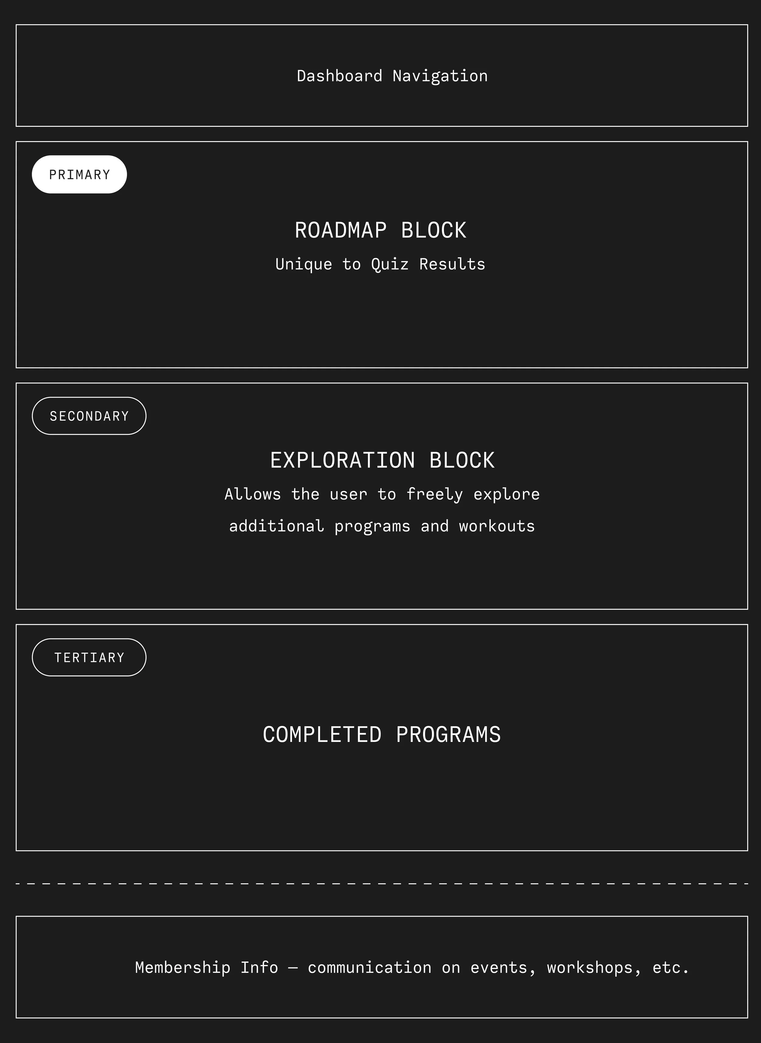
Roadmap Block
This area would present the users with their current Program (set of workouts) alongside their upcoming Programs as part of their roadmap results. It would also give them the ability to retake their quiz to try another roadmap.
Exploration Block
Allowing the users to explore all other Programs outside of their roadmaps.
Completed Block
This area would showcase all active and completed Programs both within and out of their Roadmaps, giving the users the ability to restart completed Programs all within their dashboard.
Solution
We worked with a modular design to simplify the dashboard view highlighting key information in the user’s journey and eliminating any barriers the user might have previously experienced.
Design

Through testing wireframes the layout with two columns for the roadmap section preformed better with the strongest visual hierarchy—allowing the user to focus on one Program at a time in their Roadmap.
Timestamps
As most of the Programs can take 12+ weeks to complete, the completed UI also featured timestamps to let users know what week of their Program they were currently in.
Move to Next
Users expressed interest in wanting freedom to jump between Programs without losing their progress. We’ve given the user the ability to “move to the next”, which would see the UI adapt to bring in the next Program from the right to the left column, and the previous Program to appear in their active Program section.
We created three sets of image cards for each section of the dashboard.
Top: Active Program in Roadmap
Middle: Active Programs (outside of Roadmap)
Bottom: Completed Programs

Dashboard Metrics
Results + Findings
+62%
Increased Views (+62%): The redesigned dashboard led to a significant surge in total views, demonstrating improved user engagement and interest with each Program of their Roadmap.
+48%
Boost in Total Time Watched (+48%): The redesign not only attracted more viewers but also encouraged them to spend more time on the platform, exploring other Programs. This reflects enhanced usability and user experience.
+43%
Higher Unique Viewers (+43%): More users engaged with the content, suggesting broader reach and possibly better user retention strategies.
From a business standpoint
20% decrease in support emails in relation to the user’s roadmap experience.
With newly onboarded members, we saw a 20% reduction in email support inquiries related to questions such as “Where do I start?”, “What exercise do I start with if I’m already past week 4 of pregnancy?”, and “What do I do next?” This decrease indicates improved user clarity and navigation within the platform.
A SUPER GREAT UPDATE!
The Founder was very ecstatic about these revisions to the dashboard and the overall user engagement that we’ve got the green light to produce an upgraded, fully immersive fitness app for our client base. Stay tuned!
Tangerine Banking
✳
Tangerine Banking ✳

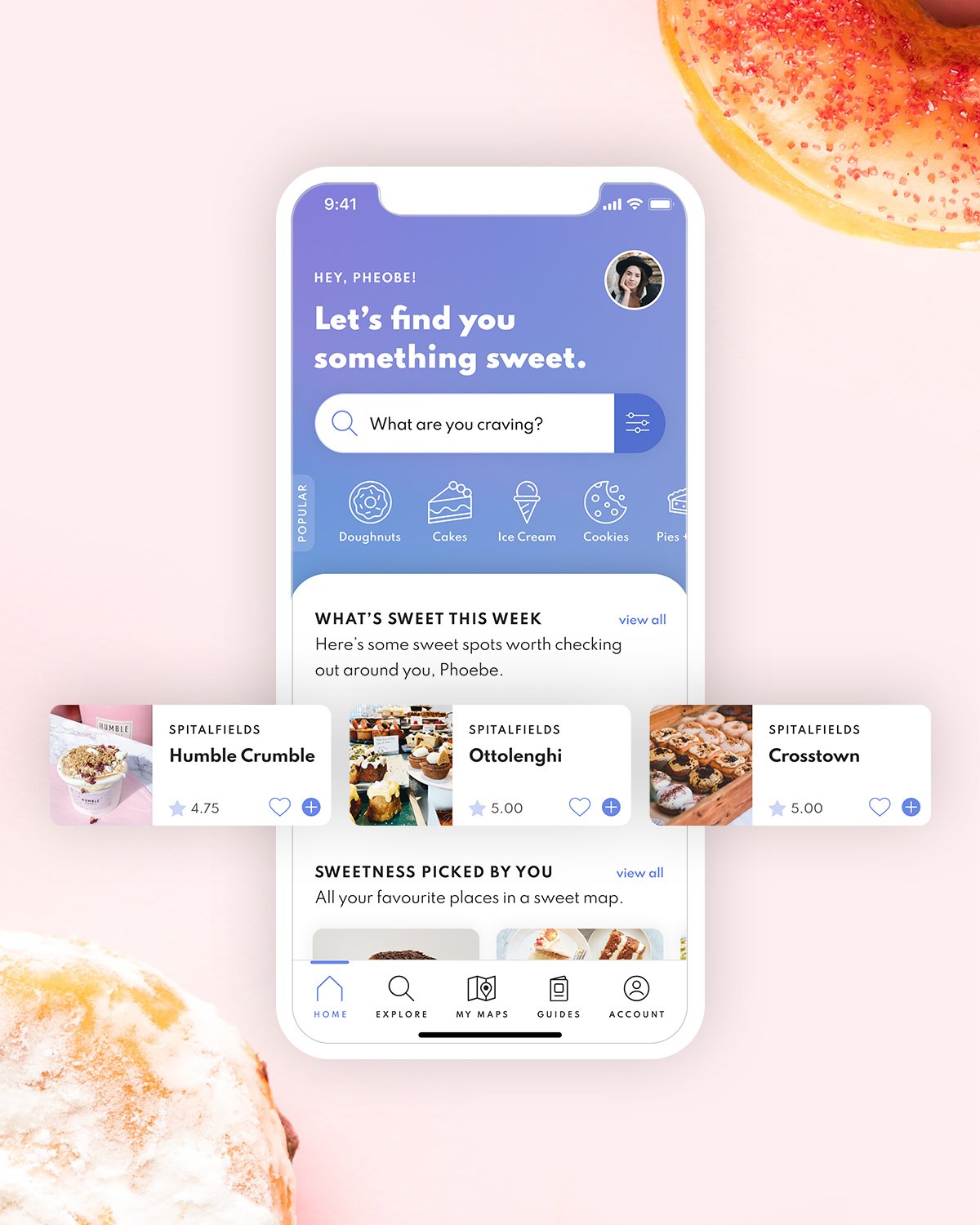
Sweet Tooth
✳
Sweet Tooth ✳